

Is it easier to open an account with one of the challenger banks? Maybe, but the number of clicks isn’t the best way to measure it.
I refer to this chart:

The colorful graphic comes from a test conducted by Peter Ramsey, Built for Mars founder. Here is how Peter describes the methodology behind the data:
Monzo, Revolut and Starling—often called the challenger banks—have built billion-dollar businesses around the belief that they offer the best overall banking experience.
But are they actually any better, or is it all clever marketing? To answer that question I opened 12 real bank accounts, and logged everything.
I think Peter had a great idea and even better execution. Many people who shared one of his charts on social media (and there were MANY of them) also included a link to his company’s website. I’m sure he gained a tone of quality traffic and well-deserved recognition.
But what I wanted to focus on is this conclusion:
“The challenger banks not only required the fewest clicks, but needed significantly fewer than even the best scoring traditional bank. It took 5x as many clicks to open an account with First Direct, than it did with Revolut.”
Are you looking for a better UX for your mobile banking? Check what our UX Design Studio can do for you.
While this gives us some hint about the UX of those apps I don’t think it paints the full picture, because:
- We don’t know how much time it took to make those 120 clicks in First Direct or 45 in Monzo app. We don’t know if the user liked the process or not. Sometimes if everything is in the right place on an interface clicking isn’t a problem at all. For instance, look at AirBnB onboarding process — every field is displayed on a different screen. On the other hand, if the app is buggy or has a poor UI finding few buttons might be problematic — for instance, if you offer customer onboarding with video verification and very few clicks, but the video recognition software is unable to verify your credentials on your plastic ID card.
- And second thing, even more important — there is usually more than one way to conduct an operation within a mobile banking app. Usually, there are at least two different user journeys.
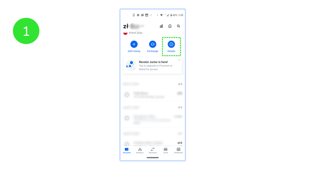
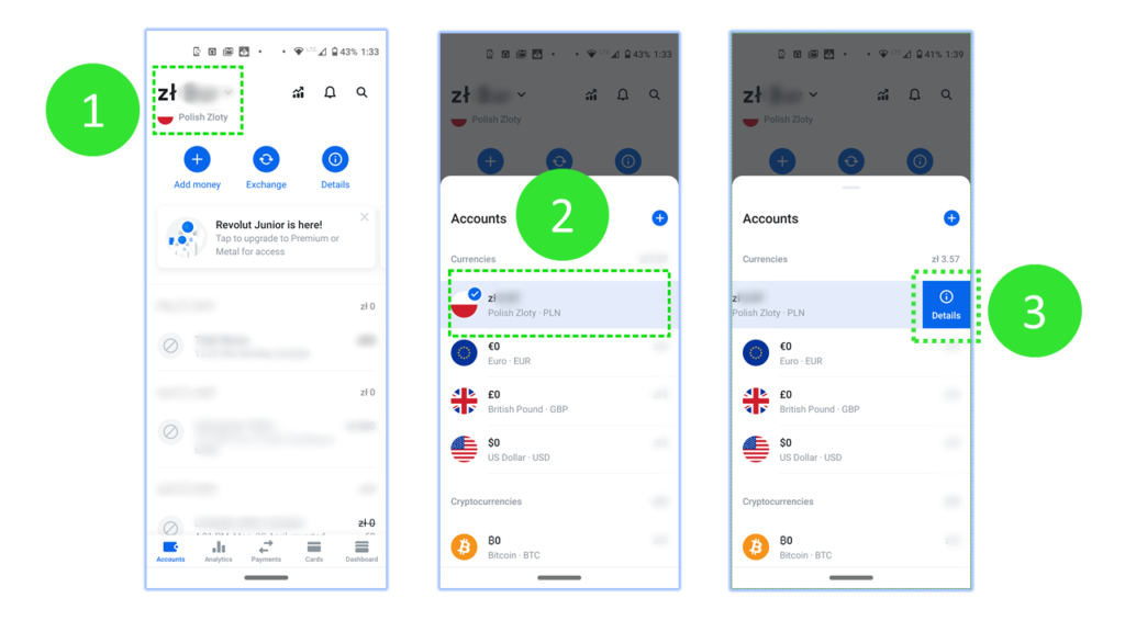
For instance, there are two different ways to check your account details in Revolut. If you are on the “Accounts” tab (and this is the default view in Revolut) you can open details by clicking the big blue “Details” button at the top of the screen:
But you can achieve the same result with a slightly longer journey. As previously, you start on the Accounts tab … but this time it takes you 3 clicks.
Yes, I know that checking details is not an onboarding process and the scenario might be different :)
I would also add a few words about the second graph from the experiment:
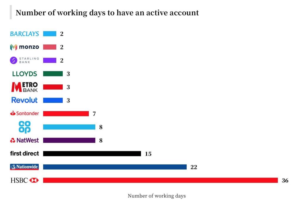
36 days seems unreal for any type of account let alone a retail banking account.
Some people point out that the time they needed to open an account differs for the Pete’s results. This may be due to the fact, that when you open an account in many different banks at the same time, some of them will notice this unusual activity and their security system will need more time to verify your intentions.
To sum it up
Once again — an interesting experiment. I wouldn’t call it “research” as this would require collecting more experiences from other customers to validate the numbers
The reason why I decided to add a comment on the matter is that so many professionals (from in- or outside the banking industry) started to cite the test and treat it as formal research.
If you want to learn more about this interesting experiment there is an in-depth discussion under Kunal Patel’s linkedin post.